Hello everyone, my favorite projects from the course were the graphic design and illustrator projects. I had a great time personally seeing the progress step-by-step while working on these projects. Not only this, but I feel that the information learned for these projects may be specifically valuable for me in the future.
I believe that being able to create logos will be beneficial in the future for me. I think that almost anyone pursuing a professional career would benefit from this as there is often a need for this type of graphic design in the workplace. I believe that understanding photoshop is beneficial in a similar way being that if at any point I find myself with the need to alter or edit a photo, I will have the skillset to do so rather than having to find a way to either learn from the internet or hire someone to do it for me.
I hope to work in education in the future, preferably in middle school, at least to start. I believe that my knowledge in graphic design and photo/video editing at this point is significant because not only do I have a potential step up on those who have not taken this course, but I am one step closer to certifying teaching graphic design (if I were to decide to do so).
I truly learned all that I had hoped to from this course, and more. There was no specific website that I found myself frequenting, however using free-to-remix music sites was incredibly helpful in using media protected by creative commons. All in all, I greatly enjoyed this course. I am glad to have taken it, and am considering taking additional graphic design courses as a potential minor now. Thank you all for your time, have a great break.
In creating this piece, I have decided to do a mock news story about the observational or conditional learning that many kittens exhibit with regards to water faucets. I have written a paper in a psychology course on a similar topic, and continue to find it fascinating.
What inspired me for this particular piece was my kitten’s behavior. For as long as she’s been able to make the jump, (she’s only 5 months old) she has made a habit of coming to the sink whenever it is turned on, opting to drink this water rather than that in her bowl-which is located directly under the sink. I have always found it interesting that, even if she watches me fill the bowl, she will still ignore it if she believes I may turn the sink on. I know this because she will wait at the sink until I leave before settling for the water bowl.
My design process and process were one and the same. I began by creating a storyboard which contained a sort of road-map through this project. I began by deciding that I would introduce my topic, provide some details for this topic, show a video shot of my cat doing what I had introduced, and close with a conclusion that nicely wraps it up-all over a mellow tune that will fade in and out when appropriate. I also knew going in that correct timing for the music fading in as well as transitions would make the project much more appealing to the eye, so that is what I did.
I believed after evaluating my clips that the clip of my cat would take too long, so I opted to adjust the speed mid-clip in order to keep viewers from having to watch a lack of movement for any extensive period of time. The most difficult aspect of this project would have to have been cropping the clips to match each other, but in the end it all worked out. I used an iPhone 8+ for filming each shot, and acquired the music titled Happy Strike.wav from AlgoTunes with a creative common or free to remix license from freesound.org. I felt that this tune had the exact upbeat but not overbearing vibe that I was looking for.
Throughout this course, I have learned a ton, as well as had a ton of fun. I truly feel that this information will prove valuable in the workplace someday, and am proud to have completed the course. I feel that I have made substantial progress with editing as a whole, as well as advancing greatly within adobe products. Thank you everyone for your time.
0:00-0:20 Introduction as a news story, I
introduce the topic of drinking water for kittens as the story’s subject. I
am considering adding an end segment in place of an audio voiceover for the
last visual element.
A cheery tune will fade out
as I begin speaking, the audio of my speaking will be the only thing audible
during the introduction. As I conclude, the tune will fade back in for the
second clip.
0:20-1:17 The
water faucet is turned on while there is no kitten in sight. After this, the
kitten comes rushing around the corner to see what was going on. Once seeing
the water and that I wasn’t using it, she jumps onto the counter and begins
drinking the water. The clip will be adjusted in speed during the middle in
order to keep from watching the cat wait for too long.
The raw audio of my turning
on the sink will be played, as well as the kitten’s meow when she approaches
the sink. There will be a voiceover explaining why many cats prefer to drink
from running water than dishes. Other than this, there will be a subtle-low
volume tune playing that will fade out as the clip concludes
(1:17-X:XX) Potentially
will add a concluding clip back at the “news station” to wrap up the segment,
but I have not decided whether or not to do so.
No extra audio will be
played at the start to focus on the things that I am saying. Towards the end
there will be a low volume tune playing that will fade out as I conclude
speaking.
For this project I decided to create
a hypothetical radio show of which I am the host. During the segment, I cut
away from the music to ask college students about their experience with living
with pets here in Pullman. This relates to my course topic because my topic is
training a kitten, and much of how a pet behaves can be traced back to how they
were trained in some way or another.
One thing that influenced me for
this project was the local rock radio in my hometown. I distinctly remember a
time years ago that I was listening to the radio in Yakima, Washington when I noticed
that callers were bickering with one another concerning which car brands were
superior. I find this hilarious to this day, and it came to mind when
brainstorming a possible idea for an “interview” type assignment. I did not do
any research for this project, however I did spend a good chunk of time
searching for the background track that I felt best fit the project.
My design process begun with
determining the premise of my assignment, followed by assembling two “radio
callers” (interview participants). After doing these things, I recorded myself
saying all lines that I would have in the project. Next, I recorded any
responses from my participants. After this, I selected some background music (as
well as a transitional chime) to play under the interview from freesound.org, a
free to remix site. It is worth noting that the creators have given consent for
their audio to be used so long as the site is credited. Once having all of the
audio together on the project, each in their own track, I begun to balance the
volume of each track in a way that complemented the project as a whole. I added
fade-ins as well as fade-outs, and I added filters to specific pieces of audio
in order to help it all to sound like one piece of work.
I did not run in to any specific
issues while creating this project, so I would say that I encountered any
specific technical challenges, however I did spend a large amount of time
adjusting individual track’s volumes in order to have the entire piece sound
seamless. Collecting all of the elements for this project was quite simple
being that I was host, able to ask the specific questions that I wanted to many
people. I chose the answers of callers whose roommates had cats because I believe that it may remove bias if the
person speaking is not the literal owner of the cat.
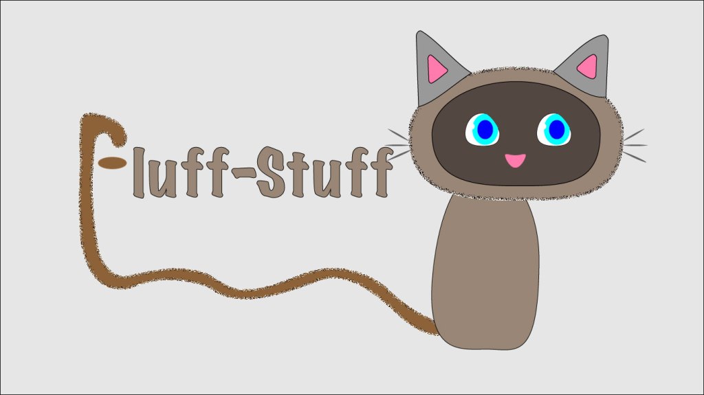
Hello all, and welcome to my logo final draft post. For this project I decided to create a hypothetical logo for a subscription service that provides pet foods and supplies. The idea is that a customer may have an app or website account set up where they are billed once a month or so to receive necessary items such as food, as well as unique extras each time such as treats or toys. The logo is supposed to be a kitten whose tail is also the letter ‘F’ beginning the brand name. In this version of this logo there is a more complete face on the kitten. I have decided not to add any legs or paws (as I felt that it would distract from the brand name). I also made significant adjustments to the tail in order to make its appearance more smooth and natural looking. On top of these changes, I made subtle alterations to the image as a whole in order to make it look more professional in its entirety. In following advice from peers, I have changed the background to a shade of off-white being that the former color was overwhelming. Another change that I made thanks to feedback was adding a subtle texture to the kitten, as well as making the stroke match for the different pieces of the kitten.
The main research that I have done for this project consists of practicing with the tutorials numerous times, as well as searching the internet for solutions to tricky tasks such as grouping objects together to be able to move them as one. The elements used in this project were greatly important being that illustrator uses lines and shapes rather than images (for the most part). Because of this, the attention to each anchor point and line segment was crucial.
In order to create the elements in this logo draft, I heavily used the elliptical tool and the polygon tool. In creating most shapes for the kitten, I would either use the elliptical and then the direct selection tool to adjust its anchor points; or the polygon tool (followed by indicating how many sides I wish for the polygon to have).
One of the only (major) issues that I have encountered was finding a way to fold the ears on the kitten. In order to overcome this obstacle, I simply searched adobe forums for a similar question. In doing so, I was led to a solution as well as many other frequently asked questions regarding similar topics. This is not abnormal and is my recommendation to those who are stuck when using adobe software-before you despair, try a simple internet search.
Hello all, and welcome to my logo draft post. For this project I decided to create a hypothetical logo for a subscription service that provides pet foods and supplies. The idea is that a customer may have an app or website account set up where they are billed once a month or so to receive necessary items such as food, as well as unique extras each time such as treats or toys. The logo is supposed to be a kitten whose tail is also the letter ‘F’ beginning the brand name. In the final version of this logo there will be a full face on the kitten, as well as potentially some added legs/paws (I have not decided if I will be adding legs or not as to not distract from the important aspect of the logo which is the brand name). I also plan to tweak the angles of the tail significantly in order to make its appearance more smooth and natural looking. On top of these changes, I plan to make subtle alterations to the image as a whole in order to make it look more professional in its entirety.
The main research that I have done for this project consists
of practicing with the tutorials numerous times, as well as searching the
internet for solutions to tricky tasks such as grouping objects together to be
able to move them as one. The elements used in this project were greatly
important being that illustrator uses lines and shapes rather than images (for
the most part). Because of this, the attention to each anchor point and line
segment was crucial.
In order to create the elements in this logo draft, I
heavily used the elliptical tool and the polygon tool. In creating most shapes
for the kitten, I would either use the elliptical and then the direct selection
tool to adjust its anchor points; or the polygon tool (followed by indicating
how many sides I wish for the polygon to have).
One of the only (major) issues that I have encountered was
finding a way to fold the ears on the kitten. In order to overcome this obstacle,
I simply searched adobe forums for a similar question. In doing so, I was led
to a solution as well as many other frequently asked questions regarding
similar topics. This is not abnormal and is my recommendation to those who are
stuck when using adobe software-before you despair, try a simple internet
search.
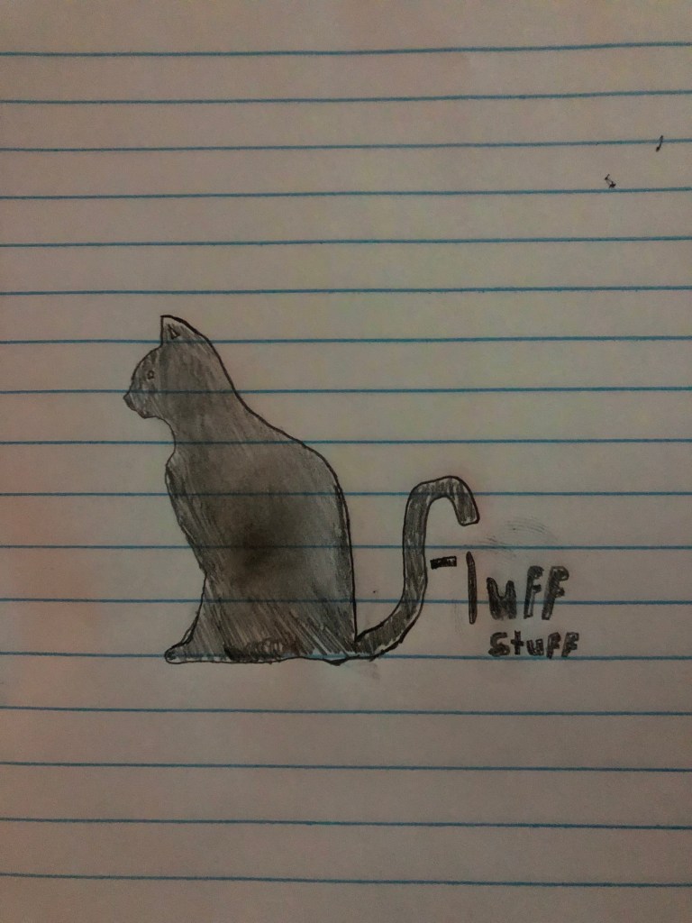
Hello all, attached is a sketch of what I plan to create for my logo! My product is a monthly subscription through which a customer would receive necessary supplies for taking care of a kitten/cat a month, as well as additional items such as treats and toys.
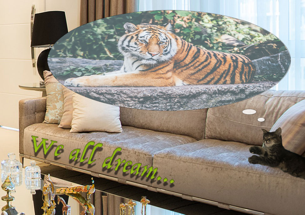
Hello, and welcome to my graphic design project. For this post I’ve decided to create a poster that illustrates the idea that cats seem to see themselves as a “top of the food chain” type of animal such as their relatives, the tigers. This topic is of course related to my topic of raising a kitten in that a new pet that acts or behaves like they are a wild tiger seems to be a difficult, and yet surprisingly common obstacle to overcome.
My inspiration for this poster came from a social media post that I saw many years ago making a joke along the lines of “what I think I look like *while doing random action* vs. what I actually look like”. This came to mind immediately as my kitten is constantly behaving as if she is much larger than she is. For example, she likes to sleep at the head of my bed in the center, across multiple pillows, making it impossible to get into my bed without waking her.
To begin creating this project I found three images that I wanted to use, each selected with a plan of where they would go and what they would look like. After locating these images, I created individual layers for each of them, and began to position them roughly where they would be as a finished result. I then used the eyeball icon on the layers to take turns showing only one-to-two layers at a time, as to be able to fine-tune each layer accurately. Some of the elements used most frequently were the magnetic lasso tool, the elliptical marquee tool, and the free transform/transform, but there were many more used to be certain.
In creating this project, the elements of Photoshop learned from the tutorials were crucial to success, and I tried my best to use most of the elements taught. However, there were also things that were not covered in the tutorials that I wished to do. These tasks were very difficult at first, but a simple search on YouTube will go a long way for most short questions such as “how to ___ on Photoshop”. I was not able to utilize feedback unfortunately, as it seems that my blog’s URL was omitted from the announcements page. However, I was able to choose a number of ways that my project could be improved.
The three main things that I decided needed improvement on my poster were: the center/focus of the image, the matching/compatibility of the color of text, and the smoothness of certain spaces between where images were placed together.
In changing the center of the image, the goal was to more easily catch the viewer’s eye on the topic of the photo-which was not the living room, it was the kitten laying on the sofa. In order to solve this, I chose to crop the background in a way that keeps the couch more in the center of the image. Another way to further this goal was in altering hue/saturation settings for the background layer, taking some of the color away from the living room, making the other layers stand out more.
the reason for altering the color of text for “we all dream” was in order to make it match better or be more comparable with the rest of the images. I noticed after turning in the draft project that the color used was not one that made sense to use in an image such as this, as it completely takes attention away from the actual focus of the image. The solution to this was to make the text a color that was much more similar to the couches, yet distinct enough to be easily readable.
The last change that I made in updating my graphic design post was in attempting to make the images that have been placed appear as seamless as possible. For example, upon re-centering the photo to focus on the sofa, I was forced to resize the layers containing the bubble that the tiger is in. I was also forced to align each of these layers precisely so that all images would appear flush. I then used a combination of tools with beneficial uses such as the blur tool in order to blur the smallest amount of pixels possible in certain areas to make the bordering areas that separate the background from other images appear unaltered. All in all, I believe that the changes made have been substantial, and that these changes have come together to improve this project significantly in aspects such as, use of space, organization, storytelling, and all-around quality.